User Guide
seismometer allows you to evaluate AI model performance using standardized evaluation criteria that helps you
make decisions based on your own local data. It helps you
validate a model’s initial performance and continue to monitor its
performance over time.
Local validation of an AI model requires cross-referencing data about patients (such as demographics and clinical outcomes) and model performance (including inputs and outputs).
This guide provides instructions on how to customize and use a Notebook.
Common terms
This section provides a list of terms used throughout this guide that you might not be familiar with:
Cohort attribute. An attribute that groups a set of patients that share a similar trait. For example, the Notebook might allow you to analyze data by race, sex, or other demographic criteria. It also might let you analyze data by other criteria, such as patients seen within a specific department or hospital.
Cohort. A set of patients that share a cohort attribute.
Event. A defined relevant action or occurrence that is important in understanding the workflows and outcomes that might be influenced through usage of the model.
Prediction. The output provided by the model. One prediction is specified as a key output.
Feature. A column of data used as an input to the model.
Creating a Notebook
Creating a Seismogram (notebook) requires a couple distinct pieces of information:
Example Notebook: Starting from example notebook, while not required, is expected to be the most straight-forward. Once several types of models are supported, it is expected that a CLI will further automate combining new content into the example structure.
Configuration files: A
config.ymlfile to specify location of required data and/or other configuration files (refer to the Create Configuration Files).Supplemental info: Explanatory model-specific supplements to guide the analysis.
Update or replace the example notebook with content relevant to your model.
Using the Binary Classifier Notebook
Each Notebook provides a summary and analysis for a single model. Initially, we are providing a Binary Classifier Notebook template for predictive models that generate a single output.
Usage
Provides a summary of the data included in the Notebook, such as time period of the analysis and number of predictions made by the model.
It also provides definitions of terms used throughout the Notebook.
Logging
By default, seismometer enables logging at the WARNING (30) level.
This means only warnings and errors will be shown during normal use.
If you want more visibility into how the Notebook processes your data — for example,
how events are merged or how many rows remain after filtering — you can lower the
logging level when starting seismometer:
import logging
import seismometer as sm

# Default is WARNING/30
sm.run_startup(config_path=".", log_level=logging.WARNING)

# For more details about data changes and event-handling steps:
sm.run_startup(config_path=".", log_level=logging.INFO)

# For the most detailed view of loading, merging, and filtering operations:
sm.run_startup(config_path=".", log_level=logging.DEBUG)
This logging output can help you understand both the progress of processing and the transformations applied to your data.
Overview
Provides background information provided by the model developer to help you understand the intention and use cases for model predictions.
Feature Monitor
Provides details on the features included in the dataset.
Feature Alerts
Review insights into potential data quality issues that might have been identified while generating the Notebook. Review any alerts to verify that your dataset includes complete details for analysis. Alerts might indicate that all necessary information was not extracted into your dataset or that your workflows are not always capturing the data needed to make accurate predictions.
Feature Summary Statistics and Plots
View the summary statistics and distributions for the model inputs in your dataset.
Summarize Features by Cohort Attribute
Select a cohort attribute and two distinct sets of cohorts to see a breakdown of your features stratified by the different cohorts.
Summarize Features by Target
View a breakdown of your features stratified by the different target values.
Model Performance
Provides standardized distribution plots to evaluate model performance. Analysis is available for each prediction and encounter.
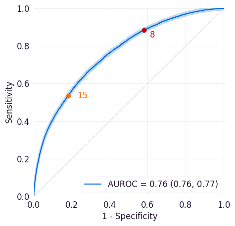
ROC Curve
The receiver operating characteristic (ROC) curve shows the sensitivity and specificity across all possible thresholds for the model. This plot can help you assess both in aggregate and at specific thresholds how often the model correctly identifies positive cases and negative cases. The AUROC or C-stat is the area under the ROC curve and provides a single measure of how well the model performs across thresholds. The AUROC does not assess performance at a specific threshold.
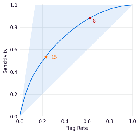
Sensitivity/Flag Curve
This curve plots the sensitivity and flag rate across all possible thresholds for the model. Sensitivity is a model’s true positive rate, or the proportion of entities in the dataset that met the target criteria and were correctly scored above the threshold set for the model. The flag rate is the proportion of entities identified as positive cases by the model at the selected threshold.
This plot can help you determine how frequently your model would trigger workflow interventions at different thresholds and how many of those interventions would be taken for true positive cases. The highlighted area above the curve indicates how many true positives would be missed at this threshold.
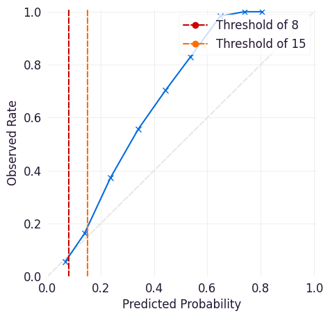
Calibration Curve
The calibration curve is a measure of how reliable a model is in its predictions at a given threshold. It plots the observed rate (what proportion of cases at that threshold are true positives) against the model’s predicted probability. Points above the y=x line indicate that a model is overconfident in its predictions (meaning that it identifies more positive cases than exist), and points below the y=x line indicate that a model is under-confident in its predictions (it identifies fewer positive cases than exist).
Note the following when using a calibration curve, particularly with a defined threshold or with sampling:
Sampling changes the observed rate, so the calibration curve might not be relevant if it is used.
Thresholds collapse the calibration curve above that probability. For example, if a workflow checks for outputs >= 15, then a score of 99 and a score of 15 are treated the same in that workflow.
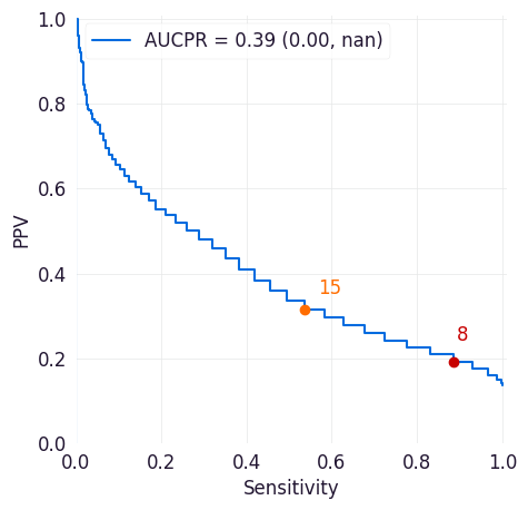
PR Curve
The precision-recall curve shows the tradeoff between precision and recall for different thresholds across all possible thresholds for the model. Precision is the positive predictive value of a model (how likely an entity above the selected threshold is to have met the target criteria). Recall is a model’s true positive rate (the proportion of entities in the dataset that met the target criteria and were correctly scored above the threshold set for the model).
This plot can help you assess the tradeoffs between identifying more positive cases and correctly identifying positive cases.
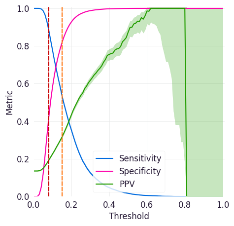
Sensitivity/Specificity/PPV Curve
This curve shows sensitivity, specificity, and precision (positive predictive value or PPV) across all possible thresholds for a model, and it can help you identifying thresholds where your model has high enough specificity, sensitivity, and PPV for your intended workflows.
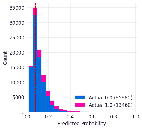
Predicted Probabilities
This curve shows predicted probabilities for entities in the dataset stratified by whether or not they met the target criteria. It can help you identify thresholds where your model correctly identifies enough of the true positives without identifying too many of the true negatives.
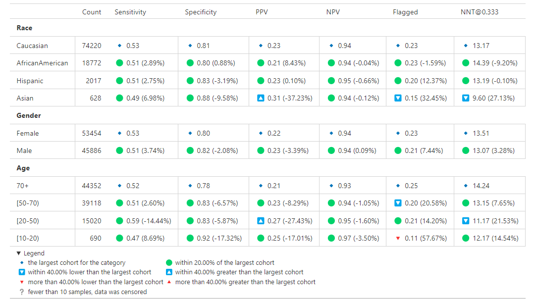
Analytics Table
Provides a table of performance statistics to compare performance across multiple models/scores and targets centered around two values selected for a specific monotonic (with respect to Threshold) performance metric.
The Analytics Table is customizable, allowing users to select the metrics and values that are most relevant to their analysis. Users can easily switch between different metrics and adjust the metric values (essentially change threshold by other means) to see how performance statistics change. This flexibility makes it a useful tool for model evaluation and comparison.
Metric:
The table provides performance statistics for specified values (two values that users can specify) of metric. This could be one of Sensitivity, Specificity, Flag Rate, or Threshold. Users can select the metric that best suits their analysis needs, allowing for a focused comparison of model performance based on the chosen criteria.
Generated Statistics:
The table provides a combination of overall (e.g., Prevalence and AUROC) and threshold specific (e.g., Sensitivity, Flag Rate, Specificity, etc.) performance statistics. These statistics offer a comprehensive view of model performance, highlighting both general trends and specific behaviors at the selected metric values. This dual perspective enables users to make informed decisions about model effectiveness and areas for improvement.
Example:
Consider a scenario where you want to evaluate the performance of different models based on the Sensitivity metric at two specific values, 0.7 and 0.8. The following table is generated to compare the performance statistics:
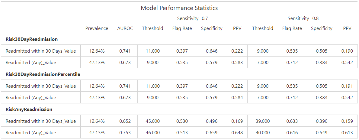
In this example, the table displays various performance statistics such as Sensitivity, Specificity, Flag Rate, and Threshold for the specified values. By adjusting these values, users can observe how the performance metrics change, providing valuable insights into the strengths and weaknesses of each model. This allows for a more informed decision-making process when selecting the best model for a given task.
Categorical Feedback
This section presents Likert plots, which are stacked horizontal bar charts, to explore and compare various categorical columns. While these plots support any categorical data with less or equal to 11 categories, they are primarily designed for those related to categorical feedback. Likert plots are a powerful visualization tool for understanding the distribution of responses across different categories, making them ideal for analyzing feedback data.
The ExploreOrdinalMetrics tool facilitates the comparison of the distribution
of different feedback columns for a specific cohort. This tool allows you to
visualize how feedback varies across different categories, helping to identify
patterns and trends in the data. For example, you can see if certain feedback
categories are more prevalent for specific readmission risk levels.
Furthermore, the ExploreCohortOrdinalMetrics tool enables the exploration of
the distribution of a specific feedback question (categorical column) across a
cohort attribute (e.g., Age). This tool is particularly useful for understanding
how feedback varies across different demographic groups. For instance, you can
analyze how feedback on clarity differs among age groups, providing insights into
whether certain age groups find the data more or less clear.
Using these tools provides a comprehensive understanding of the feedback data, helps identify areas for improvement, and enables the user to make informed decisions. The included visualizations make it easy to compare, interpret, and share data.
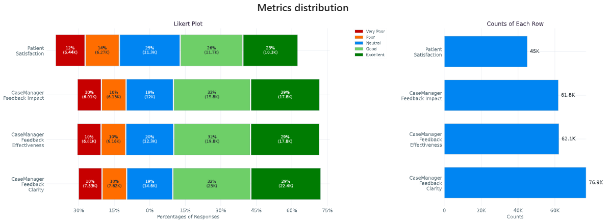
In this example, we have a column indicating the likelihood of readmission risk
('low risk', 'neutral', 'high risk'). Additionally, you have several categorical
columns corresponding to feedback ('Very Poor', 'Poor', 'Neutral', 'Good',
'Excellent') about clarity, impact, effectiveness, and overall satisfaction. These
feedback columns provide valuable insights into how users perceive different aspects
of the data.
Fairness Audit
A fairness audit can help evaluate whether a model behaves differently for subgroups within a population when compared to a designated reference group. These evaluations are useful for identifying potential differences that may warrant further investigation. However, note that such differences do not necessarily indicate a problem requiring correction. In fact, it is mathematically impossible to satisfy all fairness criteria at once so it is often best to focus on a few key fairness definitions while being aware of others.
Fairness audits should be performed by individuals who have deep knowledge of both the model and the real-world context in which it is used. Metrics flagged during the audit may reflect meaningful differences due to context, rather than unfairness. For example, variations may be expected and justifiable based on population characteristics.
Different fairness concepts may go by different names depending on the source. Some commonly referenced ones include:
Equal Opportunity: Parity in true positive rate
Predictive Equality: Parity in false positive rate
Demographic Parity: Parity in predicted positive rates (predictive prevalence)
Understanding Fairness Thresholds and Ratios
The audit examines how fairness metrics vary across groups for each cohort attribute (e.g., race, gender, age). One group, typically the largest, is chosen as the reference group, and each other group’s results are compared to this baseline.
To assess disparity, the audit calculates a ratio for each metric:
Ratio = Metric value for group / Metric value for reference group
This ratio is then compared against a fairness threshold, which defines acceptable bounds for differences. For example, a commonly used threshold is 25%, based on the “Four-Fifths Rule.”
Fairness bounds are calculated as:
Upper Bound:
1 + threshold(e.g., 1.25 for a 25% threshold)Lower Bound:
1 / (1 + threshold)(e.g., 0.8 for a 25% threshold)
If the ratio for a group falls outside these bounds (e.g., above 1.25 or below 0.8), it may indicate a fairness concern.
Example
Suppose we are analyzing a clinical risk identification model between those with and without a specific comorbidity:
PPV for those without comorbidity (reference group): 18%
PPV for those with comorbidity: 22%
The ratio is:
22% / 18% = 1.22
If we use a 25% fairness threshold, the lower bound is 0.80 and the upper bound is 1.25. Since the ratio is 1.22, this just meets the threshold. If it were slightly higher (e.g., 1.3), it would be flagged as a potential issue.
Notes on Choosing a Threshold
A threshold of 0.25 is used as the default in this analysis because it aligns with the Four-Fifths Rule, a common heuristic used in legal and regulatory settings. However, this threshold may not be appropriate for every metric or application. Users should consider adjusting it based on the context and sensitivity of the use case.
For more details, refer to:
The visualization is a table showing the overall metrics, and icons indicating default, within bounds, or out of bounds. Note that comparison across columns is not always exact due to potential differences in the included observations from missing information.
Cohort Analysis
Breaks down the overall analysis by various cohorts defined for the model.
Performance by Cohort
Select a cohort and one or more subgroups to see a breakdown of common model performance statistics across thresholds and cohort attributes. The plots show sensitivity, specificity, proportion of flagged entities, PPV, and NPV.
Outcomes
Trend Comparison
The goal of operationalizing models is to improve outcomes so analyzing only model performance is usually too narrow a view to take. This section shows broader indicators such as outcomes in relation to the assisted intervention actions. Plots trend selected events split out against the selected cohorts to reveal associations between interventions that the model is helping drive and the outcomes that the intervention helps modify.
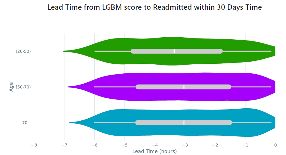
Lead Time Analysis
View the amount of time that a prediction provides before an event of interest. These analyses implicitly restrict data to the positive cohort, as that is expected to be the time the event occurs. The visualization uses standard violin plots where a density estimate is shown as a filled region and quartile and whiskers inside that area. When the cohorts overlap significantly, this indicates the model is providing equal opportunity for action to be taken based on the outputs across the cohort groups.
Cohort Selection Behavior
When no cohort values are selected (i.e., an empty cohort dictionary {}),
seismometer generally includes all rows by default, even those where the
cohort attribute is NaN. However, there are intentional exceptions to this
behavior: the Fairness Table, show_cohort_summaries, and cohort summaries
focused on a specific cohort attribute (e.g., Age). These tools always exclude
rows with missing cohort values to focus analysis on well-represented groups.
This behavior resembles the distinction between count(*) and count(Age)
in SQL: the former includes all rows regardless of missing values, while the
latter excludes rows where Age is null. Similarly, applying a cohort filter
places the analysis in the context of a specific cohort attribute, and rows with
missing or censored values in that column are excluded. In contrast, using an
empty cohort dictionary ({}) is considered outside that context, and all
rows are retained. The exceptions mentioned earlier occur in tools that
explicitly evaluate data within the context of a cohort attribute and therefore
apply stricter filtering.
Example:
Assume your data includes a categorical column age with values:
['[0-10)', '[10-20)', '[20-50)', '[50-70)', '70+']
And the cohort is defined as:
cohorts:
  - source: age
    display_name: Age
seismometer will create a new column Age. During preprocessing, if any
values (e.g., '[0-10)') occur fewer than censor_min_count times, they
are removed from the list of valid categories and replaced with NaN in the
Age column.
This results in two distinct filtering behaviors:
Filtering with all available categories selected (i.e.,
sg.available_cohort_groups): Only rows whereAgeis one of the common categories (e.g.,['[10-20)', '[20-50)', '[50-70)', '70+']) are included. All rows whereAgeisNaN(such as those with rare[0-10)values) are excluded.Filtering with
{}(an empty cohort dictionary): Generally,seismometerretains all rows, including those withAgeasNaN. However, in the Fairness Table,show_cohort_summaries, and similar cohort summaries, this behavior is overridden and rows with missing cohort values are excluded, even under empty selection.
This behavior ensures that full data is available for general analysis, while key tools maintain statistical clarity by excluding underrepresented groups.
Score Aggregation Behavior
When generating one row per context – for example, by selecting the maximum
score – seismometer applies cohort filtering before aggregation.
This means that the system first restricts the data to
only the rows that satisfy the cohort filter, and then selects one row per
context from that subset.
This ordering differs from an alternative approach where aggregation would be performed first and cohort filtering applied to the aggregated rows. The ordering affects which contexts are included in the final result.
Example:
A context has two rows:
- Row A: Age = '[0-10)', score = 0.9
- Row B: Age = '[10-20)', score = 0.95
With a cohort filter {"Age": "[0-10)"}:
In the filter-then-aggregate approach (used by
seismometer): - Only Row A is retained before aggregation. - The context is included, and Row A is selected as the result.In the aggregate-then-filter approach: - Row B is selected first (e.g., as the max score). - Since Row B does not satisfy the filter, the context is excluded.
In other words, seismometer keeps a context if at least one of its rows
satisfies the cohort filter.
High-Level Data Filtering
In addition to interactive cohort filtering during analysis, seismometer supports
load-time data filtering to restrict the dataset before any analysis or UI construction
begins.
This is useful for reducing memory usage, improving performance, and filtering out contextual fields (e.g., locations, departments) that are not typically used as model features but still affect the data size or complexity.
These filters are defined in the load_time_filters section of your usage configuration
file.
Why use load-time filtering?
Cohort attributes (like age, gender, race) are typically selected interactively
within the notebook using cohort selector widgets. However, some columns — such as
location, or department — may have dozens or hundreds of distinct values.
If you do not plan to analyze performance by these fields directly, but they are still needed in the dataset (for operational context or hierarchy logic), it is useful to filter them early.
This avoids:
Overloading the UI with dropdowns for fields you do not intend to evaluate
Excessively large memory use for rare or irrelevant values
Unexpected grouping or statistical noise from uncommon categories
Supported filter types
Each filter defines:
A column (
source)An action: -
include: retain only the rows with values in a list or numeric range -exclude: remove rows with specific values or ranges -keep_top: keep only the most frequent 25 values for a columnOptional: -
values: list of specific values -range: numeric filtering usingminand/ormax
Example:
load_time_filters:
  - source: location
    action: keep_top
Filtering behavior
These filters are applied once, during data load, and affect what appears in all downstream analysis — including cohort definitions, summary tables, and plots.
They are not the same as interactive cohort filters. Load-time filters happen before any UI is built and are best used for contextual fields that influence the size and shape of the data but are not used for modeling or evaluation.
Warning
Avoid applying load-time filters to model input features. Filtering on features used by the model can change the distribution of the data and may lead to misleading performance metrics, such as incorrect calibration or threshold-based comparisons.
Cohort Hierarchies
When working with cohort attributes that follow a natural hierarchy — such as
location → department → specialty — seismometer supports configuring those
relationships explicitly. This enables a dynamic UI experience where each selection
filters the next.
Instead of treating all cohort attributes independently, this feature helps you explore structured dropdowns that reflect your data’s organizational structure.
Defining cohort hierarchies
In your usage configuration file, use the cohort_hierarchies section to define one or
more hierarchies. Each hierarchy must have a name and an ordered list of cohort
attribute sources.
Example:
cohort_hierarchies:
  - name: location_hierarchy
    hierarchy: [location, department, specialty]
The hierarchy field lists the cohort attributes in top-down order. These names should
match the source fields defined under cohorts.
How the UI changes
When a hierarchy is defined, the UI renders those cohort selectors in a single row, connected with arrows to indicate dependency.
For example, the hierarchy:
[Location] → [Department] → [Specialty]
Will appear horizontally in the notebook with dynamic filtering:
Selecting a
Locationwill limit theDepartmentoptions to only those that appear under that location.Selecting a
Departmentwill then filter theSpecialtyoptions.
All other cohort attributes not listed in any hierarchy will appear in the usual flat layout below.
Use cases
Cohort hierarchies are especially useful when:
Some cohort fields have many distinct values, and only a few are relevant in context (e.g., departments that exist only within a selected location).
Certain values only make sense in context (e.g., a specialty only exists in one department).
You want to simplify filtering by following meaningful relationships between fields.
This structure avoids overwhelming dropdowns, improves selection relevance, and speeds up exploration.
Customizing the Notebook
You can customize the Notebook as needed by running Python code. This section includes tasks for common updates that you might make within the Notebook.
Create Configuration Files
Configuration files provide the instructions and details needed to create the Notebook for your dataset. It can be provided in one or several YAML files. The configuration includes several sections:
Definitions for the columns included in the predictions table, including the column name, data type, definition, and display name.
Definitions of the events included in the events table.
Data usage definitions, including primary and secondary IDs, primary targets and output, relevant features, cohorts to allow for selection, abd outcome events to show in the Notebook.
Other information to define which files contain the information needed for the Notebook
Create a Data Dictionary
The data dictionary is a set of datatypes, friendly names, and definitions for
columns in your dataset. As of the current version of seismometer, this configuration
is not strictly required.
# dictionary.yml
# Can be separated into two files, this has both predictions and events
# This should describe the data available, but not necessarily used
predictions:
   - name: patient_nbr
     dtype: str
     definition: The patient identifier.
   - name: encounter_id
     dtype: str
     definition: The contact identifier.
   - name: LGBM_score
     dtype: float
     display_name: Readmission Risk
     definition: |
        The Score of the model.
   - name: ScoringTime
     dtype: datetime
     display_name: Prediction Time
     definition: |
        The time at which the prediction was made.
   - name: age
     dtype: category
     display_name: Age
     definition: The age group of the patient.

events:
   - name: TargetLabel
     display_name: 30 days readmission
     definition: |
        A binary indicator of whether the diabetes patient was readmitted within 30 days of discharge
     dtype: int
Note that even with a binary event, it is generally more convenient to use an int or even float datatype.
Create Usage Configuration
The usage configuration helps seismometer understand what different elements
in your dataset are used for and is defined in a single YAML file. Here you will label
identifier columns, score columns, features to load and analyze, features to use as cohorts,
and how to merge in events. Events are typically stored in a separate dataset so they can be
flexibly merged multiple times based on different definitions. Events typically encompass
targets, interventions, and outcomes associated with an entity.
In this file you may also specify which metrics are exported from your runs, and what sorts of metrics you want. See the metrics documentation for more information on this option.
# usage_config.yml
data_usage:
   # Define the keys used to identify an output;
   entity_id: patient_nbr # required
   context_id: encounter_id # optional, secondary grouper
   # Each use case must define a primary output and target
   # Output should be in the predictions table but target may be a display name of a windowed event
   primary_output: LGBM_score
   primary_target: Readmitted within 30 Days
   # Predict time indicates the column for timestamp associated with the row
   predict_time: ScoringTime
   # Features, when present, will reduce the data loaded from predictions.
   # It does NOT need to include cohorts our outputs specified elsewhere
   features:
      - admission_type_id
      - num_medications
      - num_procedures
   # This list defines available cohort options for the default selectors
   cohorts:
      - source: age
        display_name: Age
      - source: race
        display_name: Race
      - source: gender
        display_name: Gender
      - source: location
        display_name: Location
      - source: department
        display_name: Department
      - source: specialty
        display_name: Specialty
   # Limit the dataset early based on contextual fields (not model inputs)
   load_time_filters:
      - source: location
         action: keep_top  # Keep most common locations for UI clarity
   # Define structured cohort selection logic using known organizational hierarchy
   cohort_hierarchies:
      - name: location_hierarchy
         hierarchy:
         - location
         - department
         - specialty
   # The event_table allows mapping of event columns to those expected by the tool
   # The table must have the entity_id column and may have context_id column if being used
   event_table:
      type: Type
      time: EventTime
      value: Value
   # Events define what types of events to merge into analyses
   # Windowing defines the range of time prior to the event where predictions are considered
   # On initial load, the events data are merged into a single frame alongside predictions, with
   # those columns appearing empty if events only occur outside the window.
   events:
      - source: TargetLabel
        display_name: Readmitted within 30 Days
        window_hr: 6
        offset_hr: 0
        usage: target
        # How to combine multiple *scores* for a context_id when analyzing this event
        aggregation_method: max
   # Minimum group size to be included in the analysis
   censor_min_count: 10

# All information about logging data to OpenTelemetry. Defaults will be provided
# if some or all of this information is absent -- each default is the one provided in
# this example (except that metric_type has no default because it is a name).
otel_metric_override:
   # The kind of metric that this pertains to. For example, Accuracy.
   Accuracy:
      # Whether metrics are to be logged from this at all.
      output_metrics: true
      # For some widgets, a while plot is provided along with a few select points on that plot.
      # If log_all, the entire plot is logged; if not, just the special points.
      log_all: false
      # For some plots, a box-and-whiskers plot is provided. This option allows us to generalize
      # the graphic display to logged metrics with an arbitrary number of quantiles.
      quantiles: 4
      # What kind of measurement this is. Counter (for measurements which should be summed up
      # after the fact), Histogram (for measurements which should be presented as a histogram), and
      # Gauge (for arbitrary numeric data) are provided as options.
      measurement_type: Gauge
See also
A separate events dataset is not required, and can be avoided if you do not need to include events other than the target. See: Using Seismometer without an events dataset
Create Resource Configuration
The resource config is used to define the location of other configuration files
and the underlying datasets that will be loaded into seismometer, and is
defined in a single YAML file.
# config.yml
other_info:
   # Path to the file containing how to interpret data during run
   usage_config: "usage_config.yml"
   # Name of the template to use during generation
   template: "binary"
   # Directory to write info during the notebook run
   info_dir: "outputs"
   # These two definitions define all the columns available
   event_definition: "dictionary.yml"
   prediction_definition: "dictionary.yml"
   # These are the paths to the data itself; currently expect typed parquet
   data_dir: "data"
   event_path: "events.parquet"
   prediction_path: "predictions.parquet"
   metadata_path: "metadata.json"
Create Metadata Configuration
The metadata configuration is used to define two pieces of metadata about the model:
the model’s name and any configured thresholds. It is typically defined in a
metadata.json file and can be referenced in config.yml using the
metadata_path field.
{
   "modelname": "Risk of Readmission for Patients with Diabetes",
   "thresholds": [0.65, 0.3]
}
Modifying the Analysis Data
When possible it is better to supplement the data upstream from seismometer, such as during data extraction, and have predictions and events files contain everything that is needed for analysis. Inevitably, there will be times when this is not possible and you need additional transformations to be done prior to most of the notebook running.
In this situation, you should modify the first cell of your notebook to run a custom startup method instead of run_startup.
The general outline of what the code should do is the same but will take advantage of the post_load_fn hook.
First, create a ConfigFrameHook() (accepts a ConfigProvider) and a pd.DataFrame and outputs a pd.DataFrame) that can modify the standard Seismogram frame to the desired state.
Then, follow the pattern of normal startup but specify your function in the loader_factory():
import seismometer as sm

def custom_post_load_fn(config: sm.ConfigProvider, df: pd.DataFrame) -> pd.DataFrame:
   df["SameAB"] = df["A"] == df["B"]
   return df

def my_startup(config_path="."):
   config = sm.ConfigProvider(config_path)
   loader = loader_factory(config, post_load_fn=custom_post_load_fn)
   sg = sm.Seismogram(config, loader)
   sg.load_data()
The benefit of this approach over manipulating the frame later is that the Seismogram can be considered frozen. Among other things, this means any Seismograph notebooks cells do not have a dependence on order and can be run multiple times.
Create Custom Visualizations
You can create custom controls that allow users to interact with the data via a set of
standardized controls. The seismometer.controls.explore module contains several Exploration*
widgets you can use for housing custom visualizations, see Custom Visualization Controls.
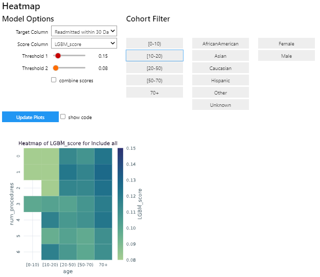
To add your own custom visualization, you need a function that takes the same signature as the Exploration widget, and
it should return a displayable object. If using matplotlib, you can use the render_as_svg()
decorator to convert the plot to an SVG, for the control to display.
This will close the plot/figure after saving to prevent the plot from displaying twice.
The following example shows how to create the visualization above.
import seaborn as sns
import matplotlib.pyplot as plt

# Control allowing users to specify a score, target, threshold, and cohort.
from seismometer.api.explore import ExplorationModelSubgroupEvaluationWidget
# Converts matplotlib figure to SVG for display within the control's output
from seismometer.plot.mpl.decorators import render_as_svg
# Filter our data based on a specified cohort
from seismometer.data.filter import FilterRule


@render_as_svg # convert figure to svg for display
def plot_heat_map(
      cohort_dict: dict[str,tuple], # cohort columns and allowable values
      target_col: str, # the model target column
      score_col: str,  # the model output column (score)
      thresholds: tuple[float], # a list of thresholds to consider
      *,
      per_context: bool # if a plot groups scores by context
      ) -> plt.Figure:
   # The signature of the function must match the ExplorationWidget's expected signature
   # This example does not use the `per_context` parameter, but it must be included in the signature
   # to match ExplorationModelSubgroupEvaluationWidget's expectations.

   # These three rows select the data from the seismogram based on the cohort_dict
   sg = sm.Seismogram()
   cohort_filter = FilterRule.from_cohort_dictionary(cohort_dict) # Use only rows that match the cohort
   data = cohort_filter.filter(sg.dataframe)

   xcol = "age"
   ycol = "num_procedures"
   hue = score_col

   data = data[[xcol, ycol, hue]] # select only the columns we need
   data = data.groupby([xcol, ycol], observed=False)[[hue]].agg('mean').reset_index()
   data = data.pivot(index=ycol, columns=xcol, values=hue)

   ax = plt.axes()
   sns.heatmap(data = data, cbar_kws= {'label': hue}, ax = ax, vmin=min(thresholds), vmax=max(thresholds), cmap="crest")
   ax.set_title(f"Heatmap of {hue} for {cohort_filter}",  wrap=True, fontsize=10)
   plt.tight_layout()
   return plt.gcf()

ExplorationModelSubgroupEvaluationWidget("Heatmap", plot_heat_map) #generates the overall widget.
The function plot_heat_map creates a heatmap of the mean of the score column for each subgroup of the cohort, based on
the fixed columns age and num_procedures.